State Posters
Objective:
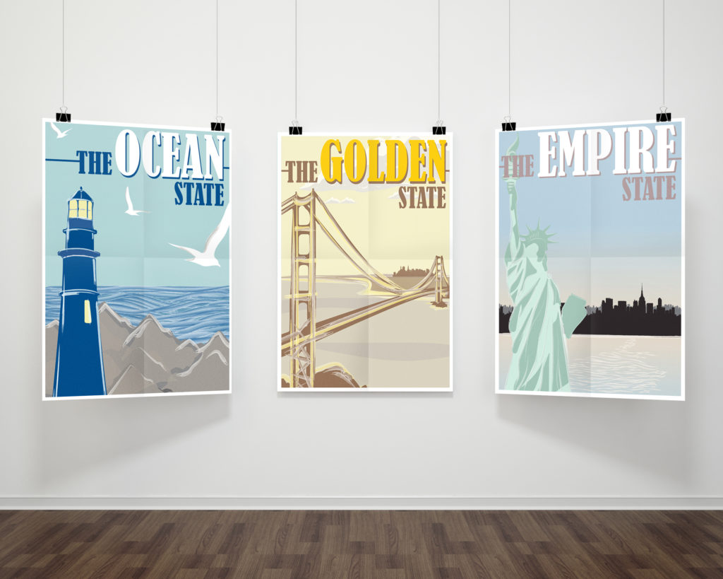
To create a sequence of posters that represent different states using typography and illustration. Each poster must share a visual consistency without including the shape or name of the state.
Research:
For this assignment, the challenge was in creating a poster where the viewer could easily identify through the use of visuals without the name or the outline of the state present. I began by researching the alternate names, nicknames, slogans, and catchphrases for the fifty states of America. This was narrowed down to 3 different states: Rhode Island, California, and New York.
Concept:
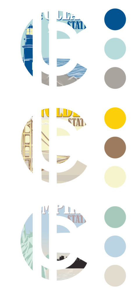
From there, I researched different icons and objects that best represented each of the states. I wanted to create a series of iconic posters that showed the significance of each state. I tried to convey the year round lifestyles and famous landmarks of each state through an emphasis on color. The thinking behind the color choices for each poster was one main core color, and two assisting colors to help exemplify the main color.
Rhode Island – The Ocean State
Rhode Island is widely known to be the smallest state in America. From the stationary lighthouses near the water in the town of Newport, to the annual Water Fires held in the capital of Providence, all of this rich, robust culture spans only as far as 37 miles.
I wanted to capture the essence of life in Rhode Island. To me, that was going to the beaches and lighthouses during late spring, summer and into early fall, enjoying the crisp, clean air to the splashes of salt water near the ocean side.
California – The Golden State
California is the poster child of the west coast. When people talk about the west coast, chances are California will be the first thing to come to mind. From the abundance of attractions ranging from the Yosemite Valley to Disney Land to the diversity and culture of the state, California has it all.
Yet, the most iconic thing that truly represents what California means as a state would be the Golden Gate Bridge. Its symbolism as a bridge is iconic, in the sense that not only does it connect different people but opportunities together.
New York – The Empire State
New York: home to Times Square, theater shows, cinemas, and huge flashing billboards. Mirroring how California is symbolic with the west coast, the same holds true with New York and the east coast.
The most iconic thing in New York is not Times Square or the Chrysler Building; I personally think it would have to be the Statue of Liberty. When people from other countries come over to visit, usually this historical landmark would be the first to come to mind.
Conclusion:
This case study drove to the forefront of my mind how important maintaining a thorough hierarchy and remaining consistent is when designing. Each of my posters have no more than three words each, yet contain an impact strong enough (through the use of color choice, font choice, and object placement) to both visually and mentally convey a message to the onlooker.


