Personal Brand
Objective:
For this assignment, we were tasked in creating a personal brand identity for ourselves. The brand identity would include the following: a logo design, a color scheme and a tagline to associate our brand with who we are as a designer.
The Process:
As a designer, this was the hardest task that I’ve had to do. It was one of the most gratifying tasks when completed, but the entire process was a journey in finding and identifying who I was as both a person and as a graphic designer. In order to create a personal brand for myself, I first had to identify what my strengths and weaknesses were, re-evaluate the process in which I created my work, and how my peers viewed me as an individual.
Mind Mapping:
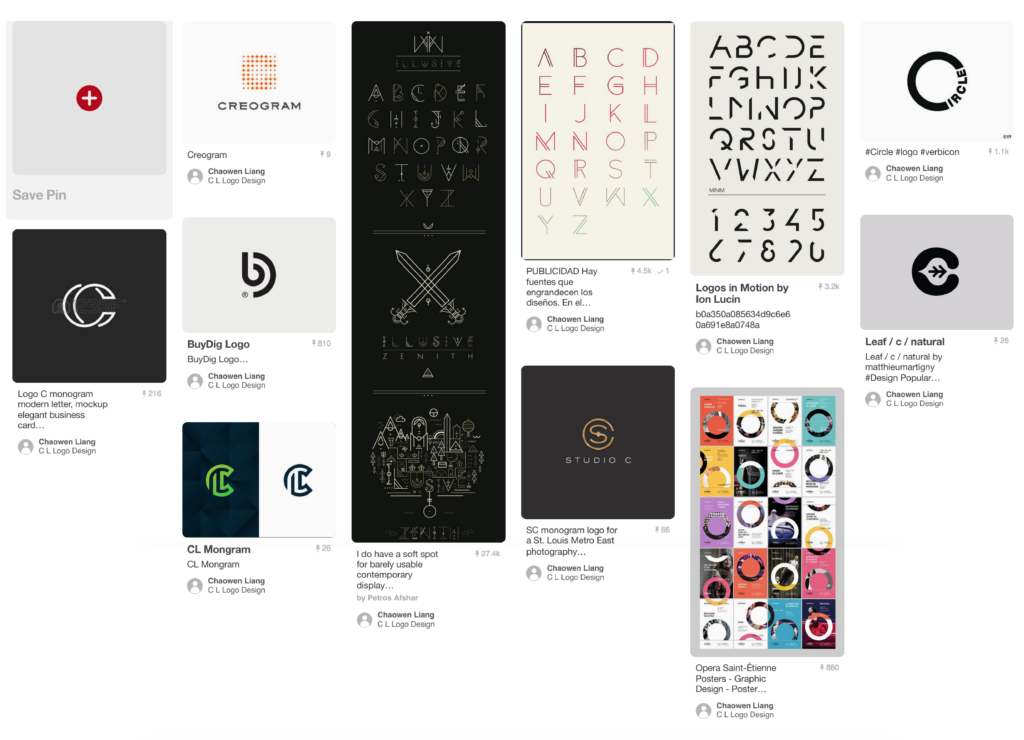
My biggest struggle was deciding on what I wanted for my logo. As the logo would become the forefront of my brand and pioneer the direction everything would be headed. I had a long debate on whether or not to use my name as part of my brand or to deviate from that entirely and create an iconic symbol that others could automatically associate me with.
Alongside that, I was also struggling with my color scheme for my brand. During my entire career at New England Tech thus far, I had designed numerous pieces of work. But all the pieces were created with certain requirements and always catered to the client (the professors). There was always a theme to the assignment, and the colors would follow suit to the theme. As such, the amount of freedom and colors to choose were infinite. The possibilities were endless, yet so were the failures.
Asking my peers for an evaluation of me, gave me a complete 180 degree perspective of what I thought of myself. My peers saw me as someone who was not afraid to speak my mind and give criticism , someone who was able to think of ideas and concepts on a whim, and not afraid of the possibility of that concept not working out.
This was extremely flattering as I never imagined myself to be that kind of person. So, I had to live up to their expectations and do what I supposedly did best.
Sketching:
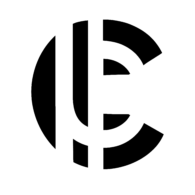
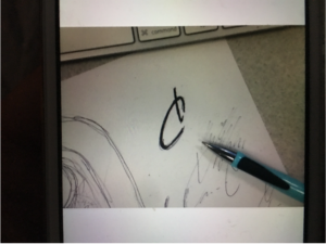
My first prototype sketch of my logo, a happy accident of my pen running out of ink when signing my initials. The circular stroke on the top half of the “C” was cut, creating an abstract L inside the C. The idea that followed this sketch was to create an elegant, modern, handwritten logo using my first and last initials.
Color Palette:
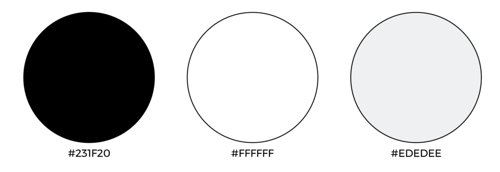 With an idea in mind, I started contemplating color choices for my brand. From the start, I had wanted my brand to have a modern feel to it. Various colors that came to mind for sleek, modern, design were the neutral colors. As I was already working in black and white, I simply kept it as such and added a rustic gray to the mix for when I would need a third color to work with.
Concepts:
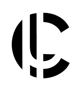
After brainstorming in Illustrator, my initial sketch brought me to this version of my logo. While it met the requirements of being simple and modern, I personally felt that it was not abstract enough. By “not abstract enough,” I mean that no matter how you viewed the logo, whatever angle it is from, there should be a consistent shape to it.
I wanted my brand identity to reflect who I was. Someone that was versatile, well rounded and open to possibilities. This would lead me to my second logo revision, which was:
By continuing the “cuts” in the lines that I used for my first logo, I got rid of the hockey stick “L” that was originally there. This would give the logo a deeper sense of positive and negative space. However, when asking for critique among my peers and classmates, the general consensus was that it looked too much like a reverse “J” than an “L” that had been divided by negative space.
With the feedback I was given, I experimented with numerous ways of trying to rid my logo of having a backwards “J.” The conclusion that I ended up arriving at was that, it did not matter that people saw the “J” at all. If they saw the “J,” why not make them see other letters as well?
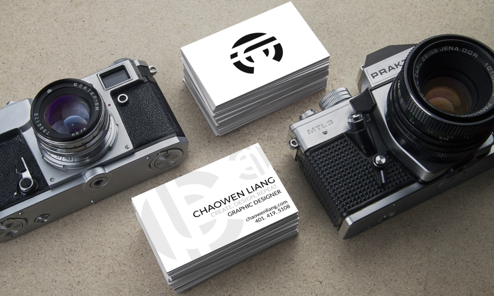
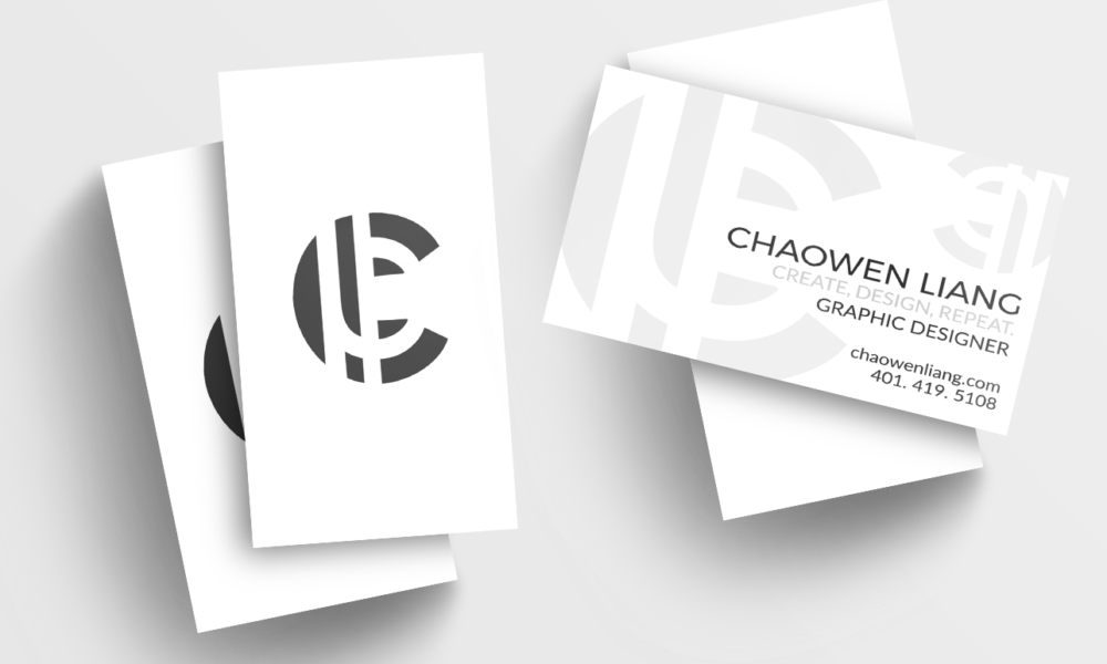
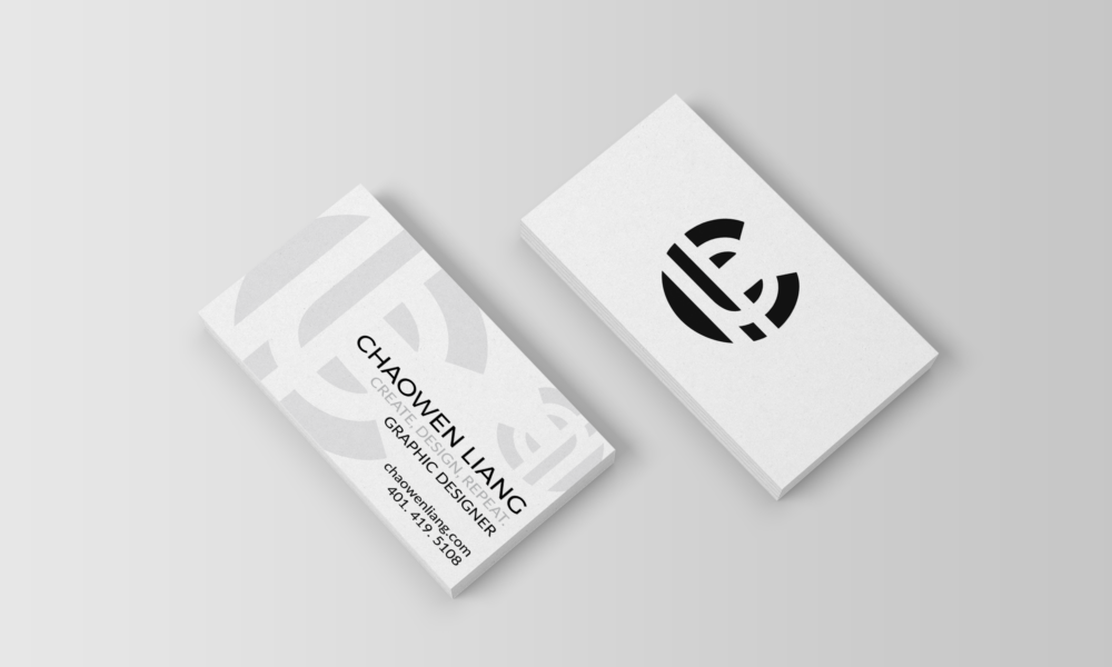
In order to do so, I mirrored the bottom of the “J” and reflected it. This would bring forth a sense of unity throughout the logo. By not being entirely symmetrical, the logo would force eye movement through the negative space, effectively moving their eye around the logo.
Font Choice:
 With the logo completed, I needed a font that would match. I settled with two San-serif fonts: Montserrat and Lato. The reasoning behind this was I wanted to be seen as modern as possible, which meant a serif font was not a possibility.
Tagline:
 “Create, Design, Repeat.” became my tagline of choice after this rigorous process of creating a brand identity for myself. The reason behind this choice was simple. I consider myself an artist before I am a designer.
While I understand that most graphic artists design something before creating it, that process has always been opposite for me. I have always been about creating something from the ground up. Only when I have created something that was my own, would I then begin “designing” it to look appealing. However, my career choice was that of a graphic designer, which was something I would love doing for the rest of my life, hence the repeat.
Conclusion:
In conclusion, this was one of the most enjoyable projects I’ve completed. The entire experience in creating a personal brand identity for myself was painstakingly hard but very gratifying in the end. I was able to discover how others viewed me as both a designer and a person and from there, I was able to grow from it and establish a brand identity.
