
Urban Grind Coffee Re-brand
Objective:
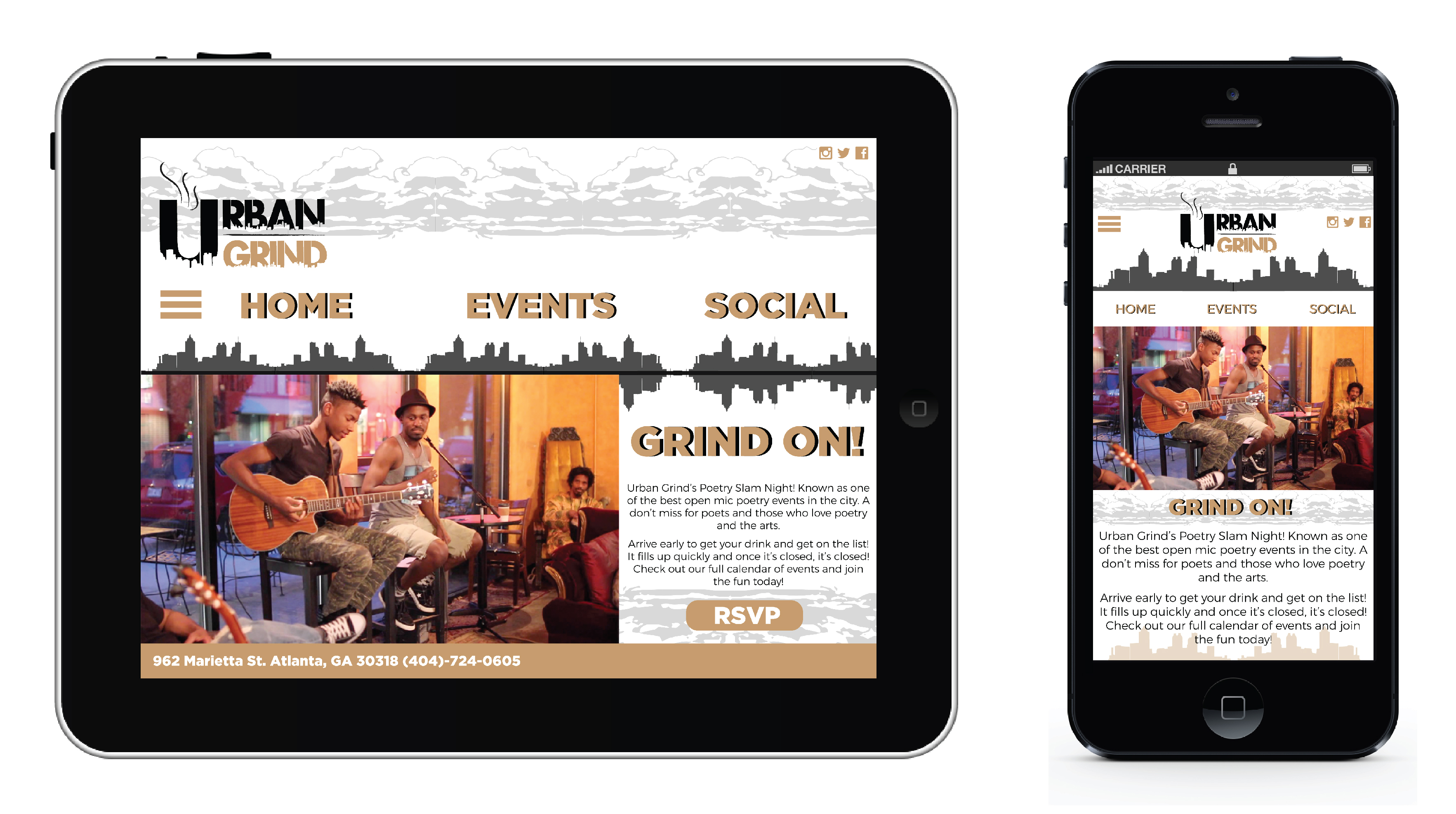
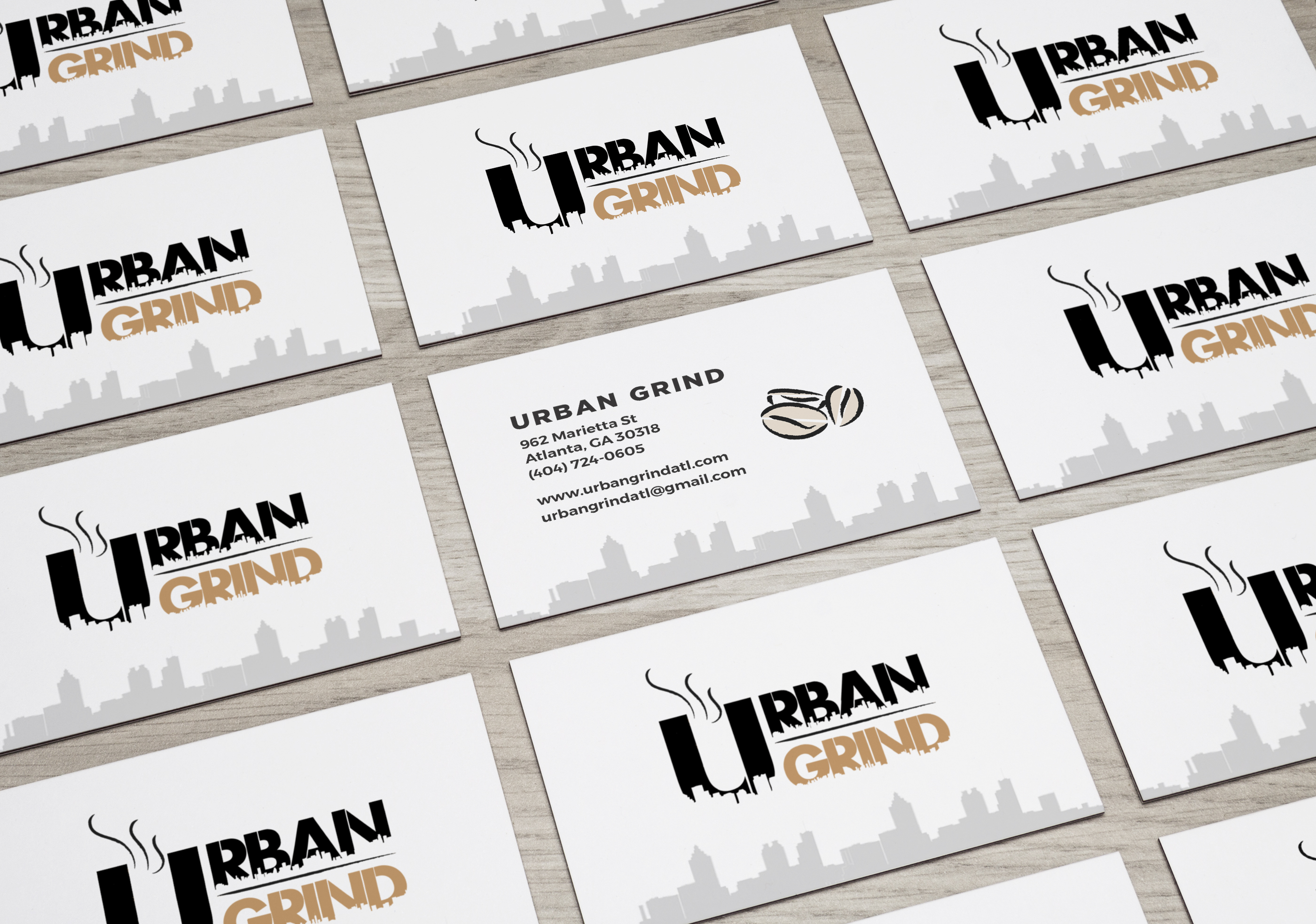
The objective of this project was to apply UI/UX on a select coffee shop brand and to re-brand it successfully. The re-brand would include the following: a new logo design, a re-branded mobile and web interface mock up, and several other product mock ups utilizing the new style.
Introducing: Urban Grind Coffee
The coffee shop that I was given to re-brand was called Urban Grind. It is located on 962 Marietta St NW in Atlanta, Georgia. This quaint coffee shop is on a strip of road next to many other restaurants and breweries. It was created by the owner; Cassandra’s desire was to create a home away from home for others based off of the experiences she had as a college student while in New York.
The Process:
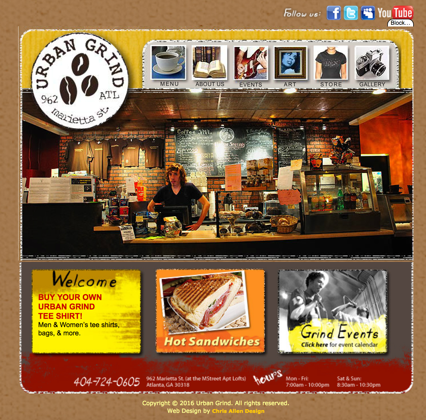
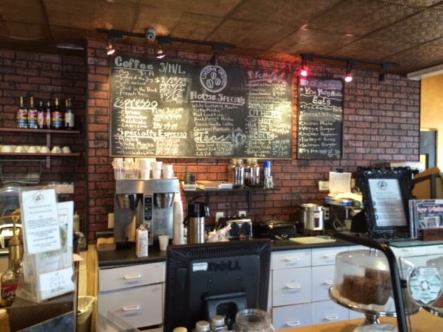
The first thing I did was to look up their current website. Next, I took notes as to what certain elements worked and what didn’t. From there, I concluded from their location what the target persona that they catered to, their competition, and their unique selling proposition.
The next step was to look at their current logo. In the picture noted below, the logo has three coffee beans, a very old typewriter, 1980s font face, and a diminishing circular stroke around it all.
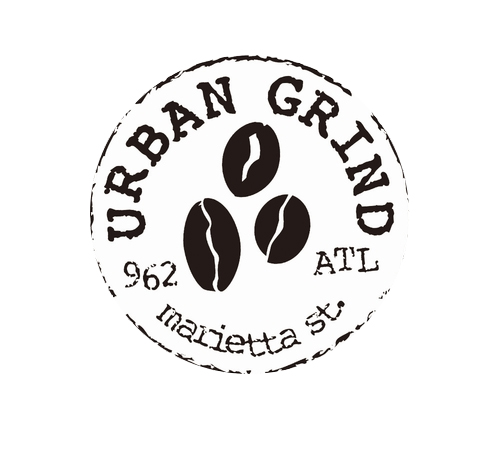
The current logo is extremely clunky and confusing. Initially, it reads as: Urban Grind 962 ATL Marietta St. This is due to the circular stroke, and the “962” and “Marietta St” not having the same font weight. Thus, the entire logo look like a vintage postage stamp.
Mind Mapping:
Immediately, I took to Pinterest to begin brainstorming and mind mapping together ideas. While creating my mood board, I explored the many different elements that pertained to coffee. Stretching from the many tools and utensils that were used to create that perfect cup of coffee to the singular rich, robust coffee bean. Any pin that managed to hold my eye for more then two seconds was on my mood board.
I wanted the re-brand to have a juxtaposition of positive and negative space, with neither taking away elements from each other. While the positive and negatives created a form of balance, I also wanted the design to be abstract, creating a fluid movement as the viewer examined the piece.
Sketching:
While mind mapping on Pinterest, I would create sketches of elements pertaining to the re-design. Sketches would be initially done on scratch paper then transferred over to Adobe Illustrator. When transferred over, they would be refined to be simpler while retaining their abstractness.
Font Choice:
With the illustrations done, typography was next. I needed a font that contained a grungy feel to it, but still sleek enough to be recognized as modern. It would be paired alongside another San-serif font to create a contemporary unison between the pair.
I ended up settling for the two fonts, Urban Jungle and Montserrat. Urban Jungle was chosen because it had the grungy feel I was looking for. The counter form of the cities meshing into the letters itself was the cherry on top. Montserrat was chosen for its simplicity, and its ability to pair well and easily with other fonts. I did, however, modify the Urban Jungle font slightly. I went over each letter that was used and covered up the grungy spots. That way, there was only the letter itself and the city in it.
Color Palette:
The original color palette that Urban Grind was using for their layout was this mocha brown, dark chocolate brown for their type, as well as this maroon red, alongside a mustard looking yellow, with dashes of orange. I wanted to keep the re-brand simple, so I wanted to settle for three core colors to use. Below are the color choices I settled on using.
I decided on the mocha brown as my base color and a simple black and gray color choice for the rest. My reasoning was that black and gray was synonymous with the word simplicity. It looks clean and because they are “neutral” colors, they can work well with any other colors selected.
Concepts:
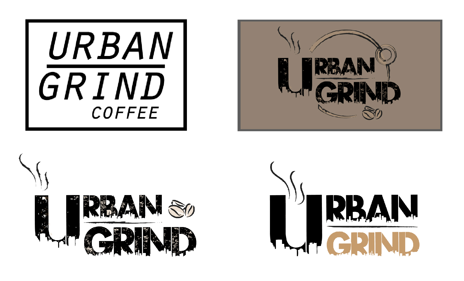
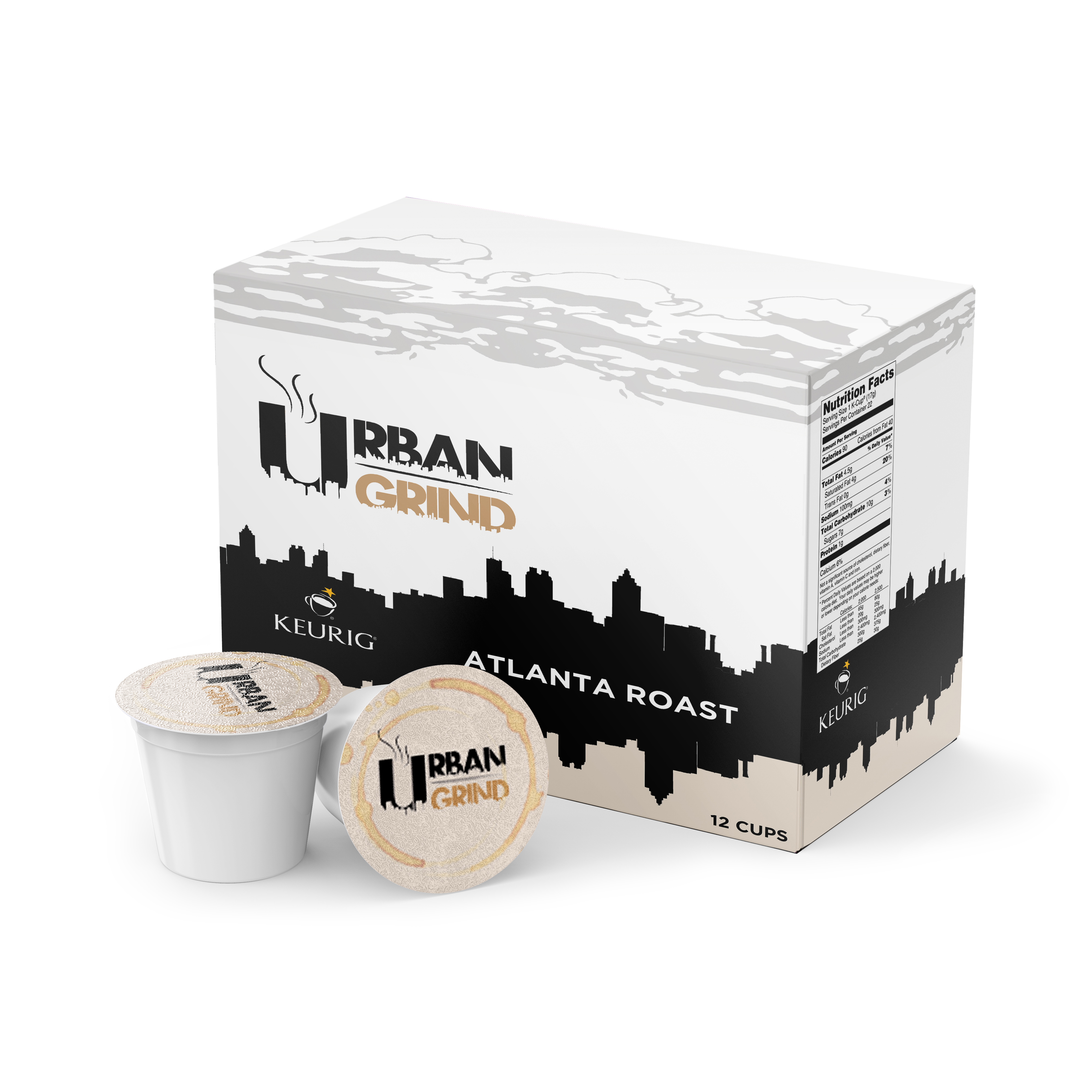
My initial logo was an extremely simple black and white placement of Urban, Grind, and Coffee on top of each other, with Urban and Grind separated by a thick line stroke, and the type italicized to give it that “edgy” feel. The second variation utilizes the Urban Jungle font alongside the variations of colors I was dabbling with. The two circles were suppose to represent coffee stains and gears “grinding” against one another. However, I felt like there was too much “noise” and that it was too cluttered.
This led me to my third version: the rich brown chocolate background is gone, along with the two circle “gears.” I moved the steam to the left part of the “U” in an attempt to mimic a chimney. The coffee beans were placed on top of the word “Grind” to create some eye movement. However, something still felt off about it. While it was simpler, I felt that it still had too much going on for the logo. Thus, I got rid of the coffee beans from the logo, enlarged both the steam and the “U,” while simultaneously placing the steam inside the arc of the “U.” Then, I changed the word “grind” to that nice, smooth mocha brown color to add some flavor into the design.
Conclusion:
Overall, this project introduced me to a variety of design aspects. I gained experience with realizing the importance of UI/UX, learning how to properly brand something, alongside figuring out how to identify a target persona, creating a unique selling proposition, and coming up with fail cases and utilizing white space in a brand. All these design elements that I learned from this project alone; taught me the proper way to make a successful re-brand.